

FNOTrader - Options Analysis Tools - Advanced Option Chain
Options Chain displays the entire options strikes available for a particular underlying in a easy to read format.

Options Chain displays the entire options strikes available for a particular underlying in a easy to read format, with the middle column showing the strike prices with Call side information on the left side, and Put side information on the right side.
One of the most used features in our website. We have strived to provide most useful information in a clear and crisp manner. It loads the latest expiry by default for the underlying.
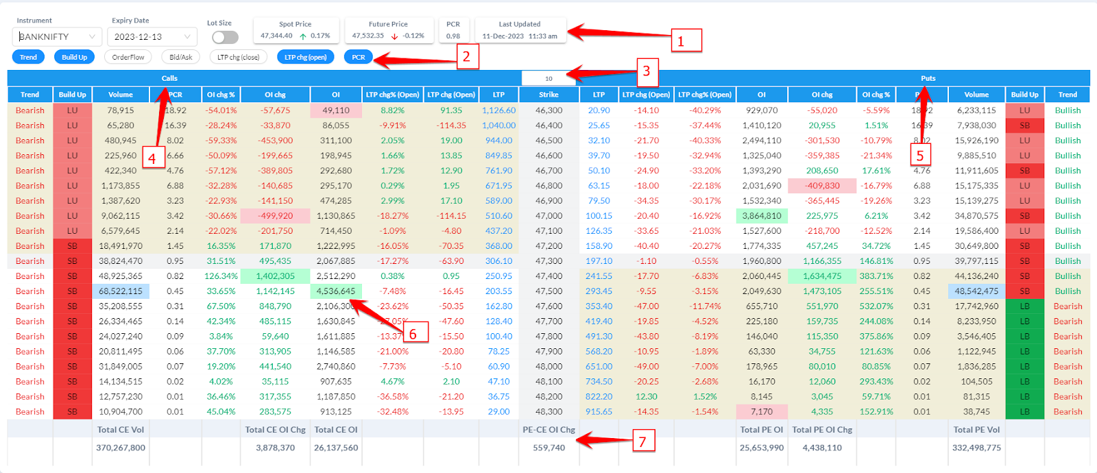
Header
Symbol Selector: Instrument and Expiry Date is used to select the unique symbol to display the option chain.
Lot Size: Toggle button to show/hide the LTP and OI as per contract size.
Shows Spot and Futures Price at the top.
PCR: Shows the total PCR (Put Call Ratio) of the selected number of strikes.
Update time: SHows the date/time of the last data update.
Column Selector:
Shows toggle buttons to show/hide the additional optional columns in the option chain table.
You can select which columns you want to display from the below list:
Trend: Shows the underlying trend of the symbol, utilizes the Buildup information at each side of the strike.
BuildUp: Shows the Price/OI relationship at each side of the strike.
Orderflow: Shows the cumulative delta value of each side of the strike.
Bid/Ask: Shows the Bid and Ask price
LTP Change (Close): Displays the change in price compared to previous close.
LTP Change (Open): Displays the change in price compared to Days Open.
PCR: Displays the Put Call Ratio of each strike. Determines if Call sellers or Put Sellers are dominating on the strike.
Number of Strike Selector
Option to select the number of strikes to be displayed. This determines the Option Chain Statistics at the bottom of the table.
& 5. Call and Put Data
Price Columns: Last Trade Price, Bid/Ask and Price Change - to give you price specific information for your analysis.
If you are an intraday trader, you will particularly appreciate the Price change as per Day Open.
Open Interest Columns: Open Interest, Open Interest Change and Change % gives you OI specific information for your analysis.
By enabling the Lot Size option, LTP, LTP Change and Open Interest Values show values as per the Contract sizes.
Volume Column displays the volume traded on each side of the strikes.
BuildUp: Displays the Price/OI relationship.

Short Squeeze Trading Strategy: Short squeeze is a term used to describe a phenomenon in stock markets where a sharp rise in the price of a futures or options, forces traders who previously sold futures or short options, to close out their positions. The strong buying pressure “squeezes” the short sellers out of the market.
As traders who previously sold short the futures or options must buy to cover their positions, the closing out of their short trades simply adds more buying pressure to the market, thus further fueling a rise in the asset’s price.
This can be a basis for a very good profitable option buying strategy.
Trend: Displays the market trend of the underlying considering the Buildup.

Trend Identification based on Option Chain: Put together the above information, observe both the Call and Put side Trend data, if both of them align to be Bullish, then it’s an extremely bullish scenario, if both of them aligns to be Bearish, then it’s an extremely bearish scenario.
If we see ITM calls and ITM Puts are Bullish but OTM calls and OTM puts are Bearish, then it’s a neutral day and highly likely to be a non-trending day. (i.e. Call and Put writers are active on the OTMs thus limiting a trending move)
Consider the Option Chain Trend Identification along with Price Action and Volume, then you will be able to catch some of the big trending moves.
Trend on Option Chain = Extremely Bullish / Bearish
Price Making New High/Low = TRUE
Volume higher on every New High or Low Breakouts = TRUE
Futures Build up = LONG BUILDUP or SHORT COVERING for Bullish Move, SHORT BUILDUP or LONG UNWINDING for Bearish Move.
BuildUp Cycle
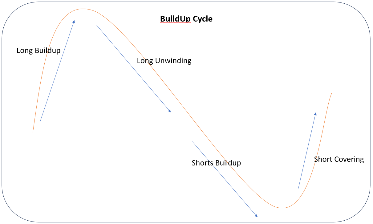
Observe the Buildups at Reversals, if the market is going up, you will first see a Long Unwinding, which shows, the longs are exiting followed by shorts getting buildup.
Conversely, if the market is going down, you will see a short covering, followed by Long build ups.
Bullish Buildup Cycle:
Observe the below chart for a bullish build up cycle, when it’s trying to breakout from a consolidation, you will most likely see a Long Buildup, after it moves 5-10%, you will see traders booking profits (long unwinding, some traders tries to call it tops and create shorts), if the stock is bullish, you will further see a positive price increase again by long buildup, which will be fueled further by shorts covering their positions, and the same cycle repeating until the momentum wanes and shorts get a upper hand and tries to bring the stock down.

6. Colour Highlighting on Option Chain
We have highlighted the data by colouring the background of a few data cells for easier identification.
On both Call and Put side, the highest value of Open Interest (OI) and highest positive “Change in OI” (max increase of OI) is shown highlighted by a green background.
The lowest value of Open Interest (OI) and highest negative “Change in OI” (max reduction in OI) is shown highlighted by a red background.
On both call & put side, max volume is highlighted by light blue background
Green highlights on both the call and put side, which are the strikes with maximum number of OI or Change in OI, acts as a possible support and resistances.
7. Option Chain Statistics
At the bottom of the table, based on the number of strikes selected to be shown, below statistics are shown which are useful to get a snapshot of the market state.
Total of Open Interest on the call and put side,
Total of Change in Open Interest on the call and put side,
Total of Volume on the call and put side,
Difference of Change in Put OI and Change in Call OI - We call this as OI Trend.
OI Trend - If you are an intraday trader and want to infer what the option market participants are trying to do, observe the OI Trend, if this curve is trending higher, that means, there are more Put Sellers compared to Call Sellers and market likely going to be bullish, if this curve is trending down, that means, there are more call sellers compared to put sellers and the market is likely going to be bearish.
In the next post, we will explain how you can observe price action of all the option strike prices in Live Option Chain Charts.